Thursday, December 1, 2011

Skype logo


I was trying to find the typeface for skype and see if they were doing a new logo design or anything and I think this is their most recent. This typeface is Helvetica Rounded Bold.

Thursday, November 24, 2011

Youtube Logo


Ok so I love to go on youtube and searching up tips about Illustrator and Photoshop techniques. As I was looking up somethings. I was interested in what typeface is youtube in? So I found the type and it is Alternate Gothic No. Two

Thursday, November 17, 2011

Wikipedia LOGO

This is so random but I was doing my biology research and I know this is not a good source to use but anyway I looked up what wikipedia typeface is and it turns out it is Hoefler Text and this site is used for collaborative reference.

Thursday, November 10, 2011

CVS/ pharmacy


I was driving home form school I stopped by a CVS and after I finished shopping I went home and looked for the typeface for this logo and comes to show this is Helvetica. I think the CVS is bold and the pharmacy is regular helvetica.

Thursday, October 27, 2011

NoRtH FaCe


North Face what everyone wears these days. I wanted to know designed this logo that made everyone so crazy and buy these brand. In typography class we are learning different types of fonts and I came across this because I was wear a North Face jacket. As simple it is, I think the typeface for this is Helvetica. I am not sure if its regular or compressed or anything still learning the difference.

Thursday, October 20, 2011

American Typeface

I was researching logos on Google and I came across American idol and I was wondering what typeface they used and I think it is a custom font Kaufmann but with the A distorted.

Thursday, October 13, 2011

NIKE logo


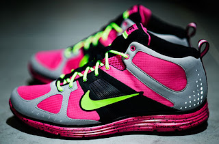
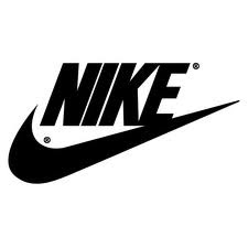
I wen tot finish line and I bought some running shoes but not like this , similar colors tho and I really like there logo design and typeface. It really stands out and very string as in it really makes you just buy their products. So by looking at their logo I went and searched their typeface and I think it is Victory Neue Bold.
Thursday, October 6, 2011

Target Logo


Talking about eye catching. It really brings audience attention and targets everyone. I think it is well design logo. Being red which that is a color that grabs attention and the simplicity of the design is well thought out. The typeface of this logo is Helvefica Neue Bold.

Thursday, September 29, 2011

Samsung LOGO


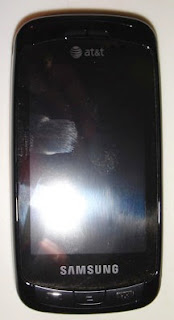
I have this phone and I was wondering what the typeface is Samsung and it really hard because the A in Samsung is missing the middle line in it and I thought that was a awesome way to create something different. I was researching the typeface and I think it is Nasdaq but I am really not sure. But it looks really close to it.

Thursday, September 22, 2011

Starbucks COFFEE


I love this drink. I at least have to have this drink twice or three times in a week. But any who so I was looking up what typeface this logo had and found out it is Freight Sans Black and it is a neat design and surely grabs people attention to drink this product.

Thursday, September 15, 2011

Doritos CHIPS


By the way I love these chips. I like the design of the chip bag, I think it is well design. The typeface stands out and looking at the chip package its really neat how they have the blue representing the part where it say "Cool Ranch". Looking at it I was trying to find the typeface for the the logo and I think it is Crillee bold Italic LET.

Thursday, September 8, 2011

BEST BUY


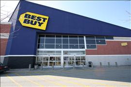
Ok I am not a fan of best buy so don't ask me but I needed something to post on my blog and yeah I buy things from there but I don't go there often like some people I know do. This is a nice simple design they created for the logo and If I were to pass by this the typeface they choose would attract my eye. The type they used is Futura bold but I am still learning my fonts so I hope I am right.

Thursday, September 1, 2011

Research about our Typeface


My type face is American Typewriter and this is the paragraph for research.

Joel Kaden and Tony Stan designed ITC American Typewriter in 1974. Joel Kaden and Tony Stan adapted the friendliness and immediacy of typewriter letter styles into a proportionally spaced typeface, ITC American Typewriter. American Typewriter can be used for business correspondence or in any work that requires an old-fashioned, personal look. The 'A' faces are identical to the regular ones, except for alternate versions of the following characters: &, $, R, e.

KFC


So I was passing by KFC after class and I was interested in the logo and the history about it but I tried to find the typeface for it and wasn't sure if I am right. What I got was Friz Quadrafa bold.

Sunday, March 6, 2011

Web design Profilo Comment


I was looking around for me to create my own web page and I noticed this cool calming page. I like how half of the page is showing a a girl or young adult in strong Gothic make up. It fits the theme of the web page.

Monday, February 14, 2011

Walmart Change


Talk about change! Walmart upgraded for sure. I like the 2ND logo much better just because it fits with a new change, it shows go green. To me I think of recycling because of the whole typeface and the writing on the bottom.

Monday, February 7, 2011

Starbucks Logo


OK I was wondering why Starbucks company changed their logo to the last image. To me if some out side the U.S. they wouldn't know what the logo was about, but I really like the one that is 2ND to to last on your right side. I don't know but I think I am just used to seeing it so I already know what it is. I think the last on on the right is to simple.

Monday, January 31, 2011

Change in Design for BMW


I like this image, just because it shows how in the past what the BMW design before and grew better and more modern as the years progressed.

Monday, January 24, 2011

60's Invitation Card


I love this invitation card. Jus because it seems so fun. You could tell what the theme of the party is about and the image also fits the typeface. The onky thing about it I would kind of change is the color. I would tone down the color just a bit so it wouldnt be harsh to the eye but there are others who say thats the point of the card or theme to attract the viewers.